Introduction
Responsive design ensures websites adapt seamlessly across devices—from desktop monitors to smartphones. In 2026, with mobile traffic exceeding 60% of global web usage, responsive websites aren't optional—they're essential for user experience, SEO rankings, and business success.
So, is Webflow responsive out of the box? The short answer: Yes, but with important nuances. Webflow provides a powerful built-in responsive framework with predefined breakpoints and flexible layout tools. However, achieving truly responsive designs requires understanding how Webflow's system works and making deliberate design choices.
Unlike traditional website builders that use rigid templates, Webflow gives you complete control over responsive behavior. This flexibility is both a strength and a responsibility—you can create pixel-perfect responsive designs, but you need to actively design for each breakpoint rather than relying on automatic adaptation.
This guide explains exactly how Webflow handles responsive design—what works automatically, what requires manual adjustment, and the best practices for creating websites that look perfect on every device. Whether you're new to Webflow or optimizing existing sites, you'll understand how to leverage Webflow's responsive capabilities effectively.
Understanding Webflow's Responsive System
Webflow's responsive framework is built into the core platform, providing professional-grade tools for creating adaptive designs.
Built-in Responsive Framework
Webflow uses CSS media queries behind the scenes, automatically generating responsive code as you design. Unlike hand-coding CSS, Webflow's visual interface lets you see responsive changes in real-time while maintaining clean, production-ready code.
Key characteristics:
- Visual breakpoint editor: Design for different screen sizes without writing code
- Cascading changes: Modifications at larger breakpoints inherit to smaller ones
- Device preview: See how designs look across devices instantly
- Responsive inspector: Identify which breakpoint styles are applied
Breakpoint System Explained
Webflow organizes responsive design around breakpoints—specific screen widths where layouts adjust. Each breakpoint represents a range of screen sizes requiring different design treatments.
How it works:
- Base styles set at desktop breakpoint
- Override styles at smaller breakpoints as needed
- Inheritance ensures consistency unless explicitly changed
- Cascading means changes flow down to smaller screens
Desktop-First Approach
Webflow defaults to desktop-first design—you design the desktop version first, then adapt for smaller screens. This approach:
Advantages:
- Matches common design workflows
- Starts with full feature set, then simplifies
- Easier for designers familiar with desktop tools
Considerations:
- Can lead to overcomplicated mobile designs
- Requires careful planning to avoid mobile bloat
- Mobile-first thinking still recommended for planning
Note: While Webflow's interface is desktop-first, you can adopt a mobile-first mindset by designing mobile layouts thoroughly before scaling up.
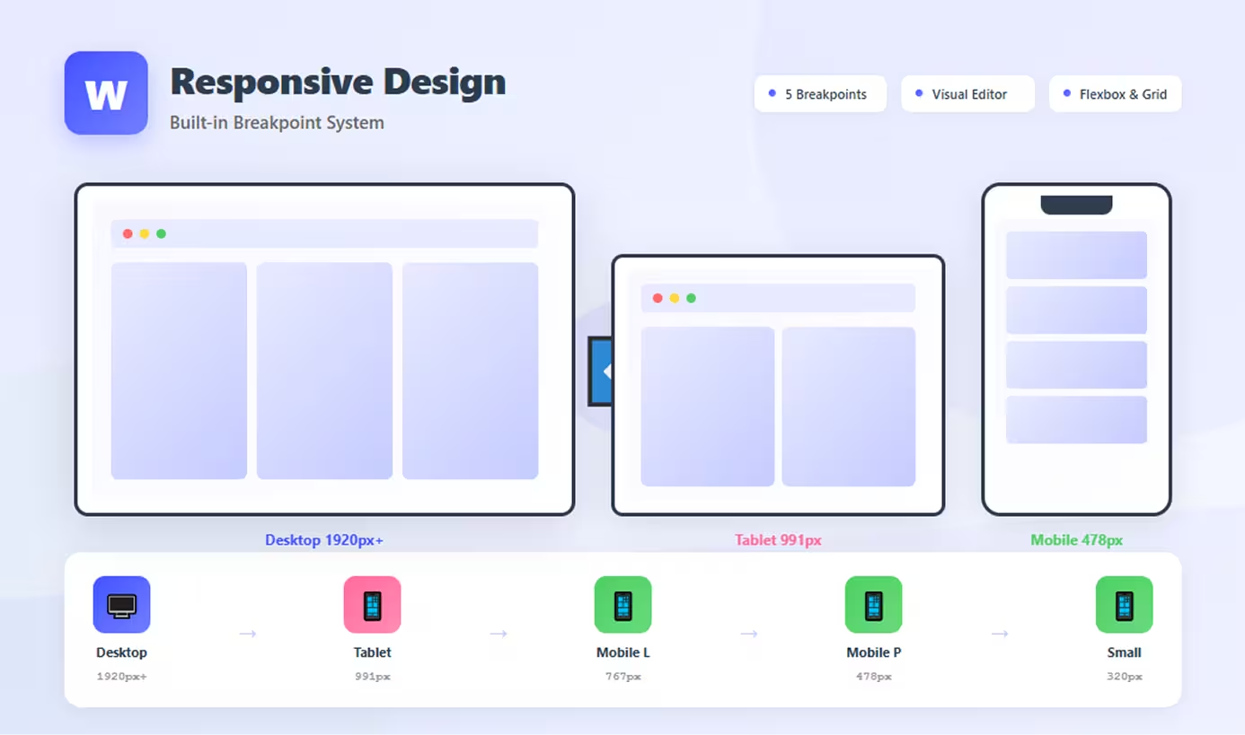
Webflow's Default Breakpoints
Webflow provides five standard breakpoints covering the full spectrum of devices.
Desktop (Base Breakpoint)
- Width: 1920px and above (no upper limit)
- Purpose: Large desktop monitors and default design canvas
- Typical use: Full-featured layouts, multi-column designs, maximum content
What to design:
- Full navigation menus
- Multi-column layouts
- Large hero sections
- Spacious padding and margins
Tablet (991px)
- Width: 992px to 1199px
- Purpose: Tablets in landscape, small laptops
- Typical use: Simplified multi-column layouts, adjusted spacing
Common adjustments:
- Reduce columns (4 to 3, 3 to 2)
- Adjust font sizes slightly
- Modify navigation spacing
- Tighten margins
Mobile Landscape (767px)
- Width: 768px to 991px
- Purpose: Tablets in portrait, large phones in landscape
- Typical use: Single or two-column layouts, condensed content
Common adjustments:
- Switch to 1-2 column layouts
- Stack previously side-by-side elements
- Hamburger menu implementation
- Reduce image sizes
Mobile Portrait (478px)
- Width: 479px to 767px
- Purpose: Most smartphones in portrait mode
- Typical use: Single-column layouts, mobile-optimized navigation
Common adjustments:
- Fully stacked layouts
- Mobile menu required
- Larger touch targets
- Simplified typography hierarchy
Small Mobile (320px)
- Width: 320px to 478px (base)
- Purpose: Small smartphones, older devices
- Typical use: Ensure nothing breaks on smallest screens
Common adjustments:
- Final spacing tweaks
- Minimum font size enforcement
- Ensure content doesn't overflow
- Test critical interactions
How Breakpoints Work
Inheritance model:
- Style an element at Desktop
- Unless overridden, style applies to all smaller breakpoints
- Override at Tablet to change appearance from that point down
- Further override at Mobile Portrait for phone-specific styling
Example:
- Desktop:
padding: 60px - Tablet: Override to
padding: 40px(applies to tablet and smaller) - Mobile Portrait: Override to
padding: 20px(applies to mobile only)
What Works Responsively Out of the Box
Many Webflow elements adapt automatically when designed with flexible approaches.
Percentage-Based Layouts
Auto-responsive elements:
- Width set to percentage (50%, 100%, etc.): Scales proportionally
- Max-width properties: Prevents excessive stretching
- Auto margins: Centers content automatically
- Relative units (VW, %): Adapts to viewport
Example: A container set to width: 90%; max-width: 1200px automatically scales on all devices while capping at 1200px on large screens.
Flexbox and Grid
Webflow's layout tools are inherently responsive:
Flexbox:
- Wrap behavior: Items automatically wrap to new lines when space runs out
- Flexible grow/shrink: Elements adjust size based on available space
- Alignment properties: Work across all screen sizes
CSS Grid:
- Auto-fit and auto-fill: Columns adjust based on available width
- Fractional units (fr): Proportional sizing that scales
- Grid template areas: Can be redefined per breakpoint
Images and Media
Images adapt when configured properly:
- Width: 100%: Scales with container
- Height: auto: Maintains aspect ratio
- Max-width: 100%: Prevents overflow while allowing smaller sizes
- Object-fit properties: Control how images fill spaces
Videos:
- Embedded videos (YouTube, Vimeo) in Video element are responsive
- Background videos require manual breakpoint adjustments
Typography Scaling
Webflow allows breakpoint-specific typography:
- Font sizes can differ per breakpoint
- Line height adjusts independently
- Letter spacing customizable per screen size
Not automatic: You must manually adjust typography at each breakpoint—Webflow doesn't auto-scale text.
Navigation Elements
Navbar component includes responsive features:
- Menu button for mobile breakpoints
- Auto-hide menu on smaller screens
- Dropdown behavior adapts to mobile
Requires setup: You must configure which breakpoint shows the menu button and style the mobile menu appearance.
What Requires Manual Adjustment
Not everything adapts automatically—these elements need deliberate responsive design.
Fixed-Width Elements
Problematic patterns:
- Pixel-based widths (300px, 500px): Don't scale, may overflow
- Fixed heights: Can cause text overflow or clipping
- Absolute positioning: Positioned elements don't reflow
- Fixed navigation: May not fit smaller screens
Solution: Use percentages, max-widths, and flexible units instead of fixed pixels.
Complex Layouts
Multi-column designs require breakpoint-specific adjustments:
- 4-column grids: Reduce to 2 columns on tablet, 1 on mobile
- Side-by-side sections: Stack vertically on mobile
- Asymmetric layouts: Simplify to symmetrical on small screens
Webflow doesn't automatically collapse columns—you must adjust grid/flexbox settings per breakpoint.
Custom Spacing
Padding and margins often need breakpoint adjustments:
- Large desktop spacing (80px) overwhelms mobile
- Vertical rhythm requires recalibration
- Section spacing needs mobile optimization
Best practice: Reduce spacing progressively at each smaller breakpoint (e.g., 80px → 60px → 40px → 20px).
Specific Design Elements
Requires manual work:
- Hero sections: Different images, text sizes, layouts per breakpoint
- Forms: Adjust input widths and button sizes
- Cards and components: May need layout changes (grid to list)
- Overlays and modals: Ensure they fit mobile screens
- Animations: May need to be simplified or disabled on mobile
Best Practices for Webflow Responsive Design
Maximize Webflow's responsive capabilities with these proven strategies.
Design Mobile-First Mindset
Even though Webflow is desktop-first technically, think mobile-first strategically:
- Plan mobile layouts before designing desktop
- Identify essential content that must appear on mobile
- Design desktop as enhancement of mobile experience
- Avoid mobile-only afterthoughts
Use Flexible Units
Choose responsive-friendly units:
- Percentages for widths:
width: 80%instead ofwidth: 960px - VW (viewport width) for responsive sizing:
width: 90vw - EM/REM for typography: Scales with base font size
- Max-width to cap sizes:
max-width: 1200pxprevents excessive stretching
Avoid:
- Fixed pixel widths unless absolutely necessary
- Pixel-based padding/margins (use percentages or viewport units)
Test Across Breakpoints
Webflow's preview modes let you test instantly:
- Use breakpoint selector at top of Designer
- Preview on actual devices before launching
- Check every breakpoint for each page
- Test interactions at all sizes
Common issues to check:
- Text overflow in smaller containers
- Images breaking layouts
- Navigation functionality
- Form usability
- Button touch targets (minimum 44px × 44px)
Leverage Webflow's Tools
Built-in responsive helpers:
- Hide/show elements per breakpoint: Hide complex desktop features on mobile
- Duplicate elements: Create separate mobile/desktop versions when needed
- Responsive images: Use different images per breakpoint via CMS or background images
- Navbar component: Built-in responsive menu functionality
Progressive Enhancement
Start simple, add complexity:
- Design clean, simple mobile layout first
- Add columns and complexity at larger breakpoints
- Introduce decorative elements only on desktop
- Keep core functionality working at all sizes
Conclusion
Webflow is responsive out of the box—but that responsiveness requires your active design decisions. The platform provides exceptional tools: flexible breakpoints, visual editing, and powerful layout systems that generate clean, responsive code automatically.
However, true responsiveness comes from how you use these tools. Percentage-based layouts, flexbox, and grid systems adapt beautifully, but complex designs, fixed-width elements, and custom spacing require deliberate adjustments at each breakpoint.
The key to success: Design intentionally for every screen size. Use Webflow's breakpoint preview to check your work, embrace flexible units over fixed pixels, and test thoroughly across devices. Don't design desktop-only and hope it works on mobile—actively optimize each breakpoint.
Webflow empowers complete responsive control without writing code. This flexibility means you can create pixel-perfect designs for every device—but you must actually create them. The responsiveness is there, ready to use. The question isn't whether Webflow is responsive, but whether you're designing responsively.
Start with mobile layouts, scale up thoughtfully, test rigorously, and leverage Webflow's built-in responsive features. Your websites will look perfect on every device.
FAQs
Q: Do I need to design every element separately for each breakpoint?
A: No, only override elements that need changes. Webflow's inheritance means desktop styles cascade down to all smaller breakpoints. You only adjust what actually needs to be different—reducing unnecessary work while maintaining consistency.
Q: Can I add custom breakpoints beyond Webflow's defaults?
A: No, Webflow provides five fixed breakpoints that cannot be customized or added to. However, these cover the vast majority of devices. If you need custom breakpoints, you'd need to use custom CSS, though this is rarely necessary.
Q: Will my Webflow site work on tablets and phones without any changes?
A: It depends. Simple layouts with percentage widths may look acceptable, but most professional sites need breakpoint-specific adjustments. Navigation almost always requires mobile optimization, and multi-column layouts should be simplified for small screens.
Q: How do I hide elements on mobile but show them on desktop?
A: Select the element, choose the mobile breakpoint where you want to hide it, and set Display: None. The element will be hidden at that breakpoint and smaller screens but remain visible on larger breakpoints.
Q: Does Webflow automatically optimize images for different screen sizes?
A: Webflow generates multiple image sizes automatically and serves appropriate versions based on screen size (responsive images). However, you may still want to use different image compositions or crops per breakpoint for optimal visual impact.